


Back
PhilDesigns Responsive Preview
Details
View on WordPress
Back
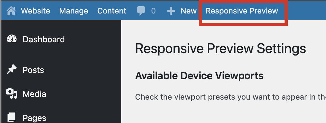
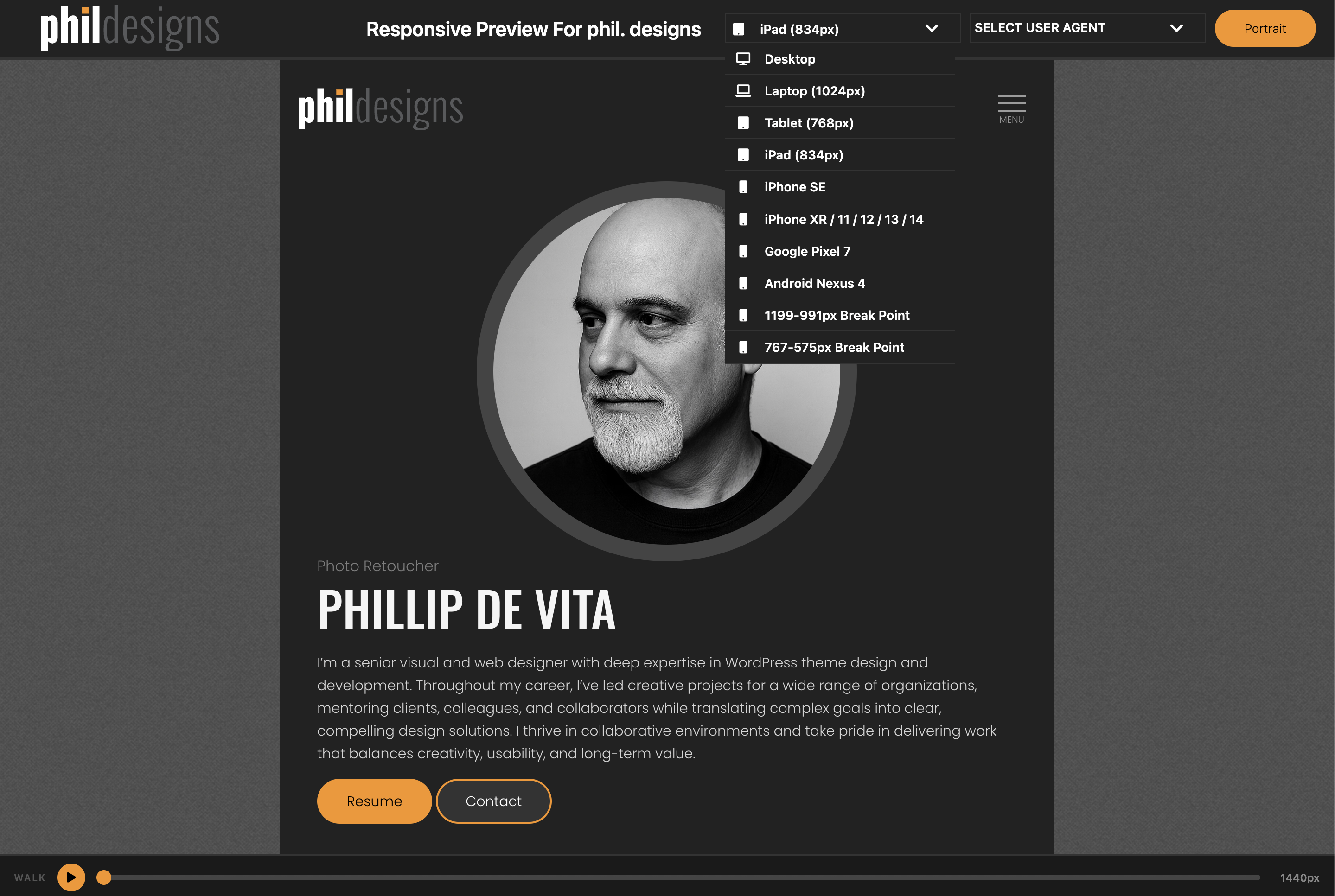
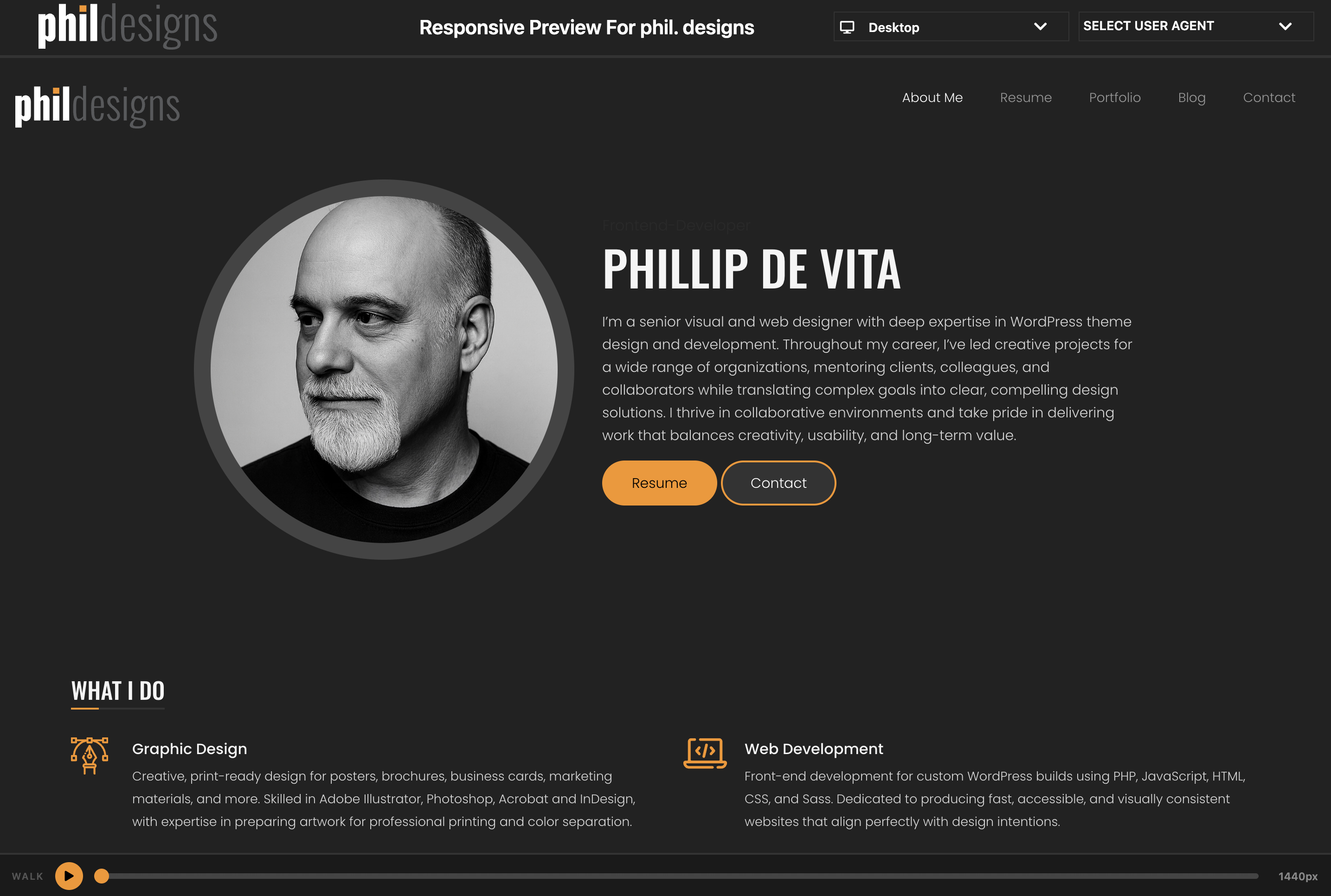
Responsive Preview adds a link to the WordPress admin toolbar that opens your site inside a full-screen preview interface. Switch between device viewport sizes and use the Responsive Walk feature to animate a smooth sweep from 1440px down to 320px.
Features
- Device Viewports — desktop, laptops, iPad, iPhones, Pixel, and more; toggle portrait/landscape on rotatable devices
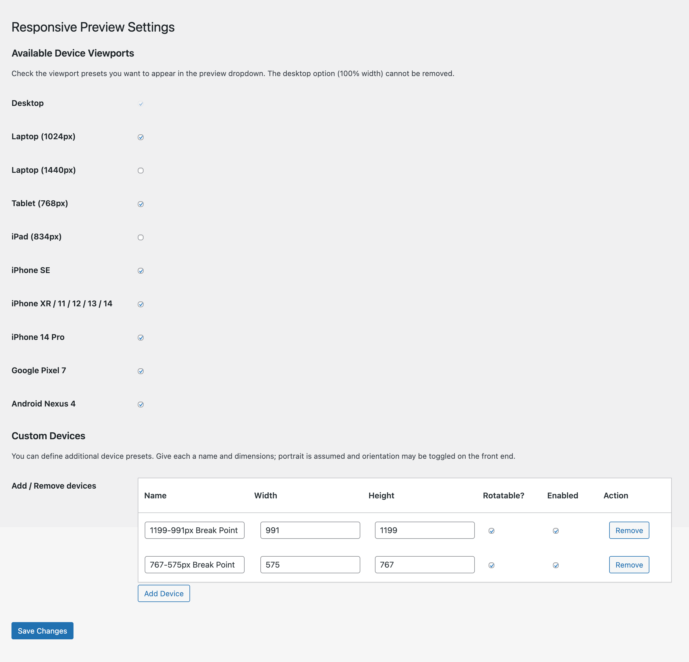
- Custom Devices — define your own device presets with a name, width, and height; manage them from the settings page
- Responsive Walk — play/pause animation that sweeps the iframe from 1440px to 320px over 10 seconds, with a scrubbable progress bar
- Settings page — enable or disable any viewport from the device dropdown
Usage
- After activation, click Responsive Preview in the admin toolbar (top bar).
- A new window opens with your site in the preview frame.
- Use the SELECT VIEWPORT dropdown to switch device sizes.
- Click the orange play button at the bottom to start a Responsive Walk.
Details
Plugin code:
phildesigns-responsive-preview
Plugin version:
3.1.1
Author:
Outdated:
No
WP version:
6.7 or higher
PHP version:
7.4 or higher
Test up to WP version:
7.0.4
Total installations:
0
Last updated:
2026-08-17
Rating:
Times rated:
0
mobile
preview
responsive
testing
viewport
Related plugins
Plugins that also contain the tag mobile
AMP

AMP for WP – Accelerated Mobile Pages

WP Mobile Menu – The Mobile-Friendly Responsive Menu

Responsive Menu – Create Mobile-Friendly Menu

WPtouch – Make your WordPress Website Mobile-Friendly

WP Responsive Menu


About
Plugin for that tries to help you find the WordPress plugin you are looking for.
| Please enjoy an image of Crush (this awesome turtle) and have a lovely day! |  |
We do not own any plugin listed on this site and do not work for or work with WordPress.com or it's associated companies. We simply provide a searchable list of the available WordPress plugins.