



Primo List
Primo List is a self-contained, dependency-free plugin for displaying curated
lists of items. Each item has a logo/image, heading, subtitle, body, optional
link and one or more categories. Render any list anywhere with the
[primo_list] shortcode.
Sponsor walls, partner logos, staff directories, product features: one
portable tool. No Custom Post Type UI, no ACF, no Bootstrap, no external
libraries, no tracking, no external HTTP calls.
Features
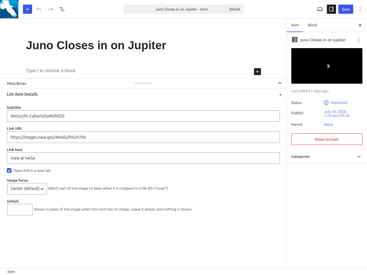
- Custom post type Item with logo (featured image), heading (title),
subtitle, body and link. - Flat Category taxonomy, multi-assignable, with a per-category weight
(prominence/sort) and optional accent colour. [primo_list]shortcode withcategory,id,layout,columns,
columns_mobile,headings,orderby,limit,lightbox,fitand
ratio attributes.- Manual ordering by drag and drop: an Order column on the Items list lets you
drag items into place, saved as you go. Useorderby="menu_order"to have that
hand-set order override category weights entirely; otherwise it breaks ties
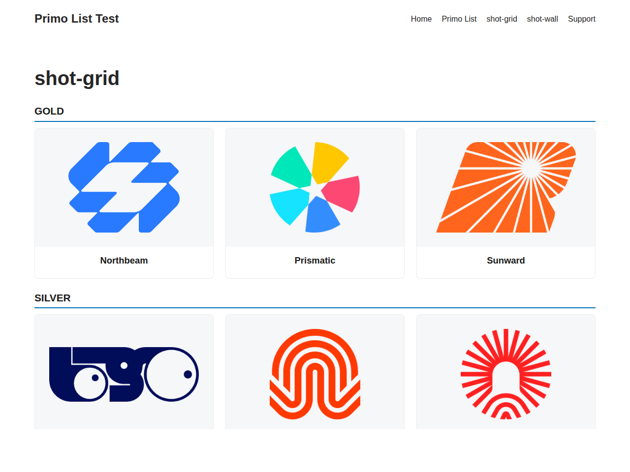
under the default weight ranking. - Uniform tiles for mixed-proportion images. Tiles default to square
(ratio="1:1"); setratioto anyW:H, orratio="auto"to size tiles to
each image. Choosefit="cover"(crop to fill, for art and photos) orfit="contain"
(letterbox the whole image with padding around it, for logos, never cropped).
The lightbox always shows the full, uncropped image. - Per-item crop focus (top / center / bottom / corners) so a
covercrop
keeps the important part of each image (e.g. a subject’s head). - Front-end edit pencil on each item for logged-in editors; jump straight to
an item’s editor while curating a gallery (never shown to visitors). - Filter items by category on the admin Items list (a dropdown above the table).
Filtering also shows the ready-to-copy shortcode for that exact category, so you
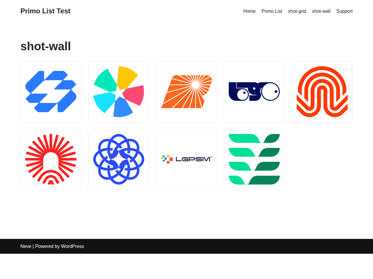
can paste it straight into a page. - Three layouts: a responsive card grid, a compact logo wall, and a
list (image beside text, one row per item, e.g. a books/catalogue page). - Responsive columns you control.
columnssets the desktop count; grids
step down to two per row on a tablet and one on a phone. Set
columns_mobile=”2″ (or more) to keep several across on a phone; useful for
a logo wall, where one giant logo per row wastes the screen. - Per-item initials shown in place of a missing image. An item with no image
and no initials shows nothing at all and the tile closes up around it. - Per-item link text so the button reads “Purchase”, “Read more”, etc.
(defaults to “Visit”). - Built-in lightbox (on by default): click an image to view the full-size
version in an overlay, with prev/next and keyboard navigation. Pure vanilla
JavaScript, no jQuery or third-party library; degrades to opening the image
when JavaScript is off. Disable per list withlightbox="no". - Weight-based ranking that ignores the category you filtered on, so tiers
sort correctly (gold before bronze). - Optional, off-by-default single item pages.
- Logos render contained: wide or tall logos are never cropped.
Documentation, worked examples and other plugins:
primowp.com.
Details
Related plugins
Plugins that also contain the tag directory
Directorist AddonsKit for Elementor

Link Library

Classified Listing – AI-Powered Classified ads & Business Directory Plugin

HivePress Reviews

HivePress Messages

HivePress Favorites


About
Plugin for that tries to help you find the WordPress plugin you are looking for.
| Please enjoy an image of Crush (this awesome turtle) and have a lovely day! |  |
We do not own any plugin listed on this site and do not work for or work with WordPress.com or it's associated companies. We simply provide a searchable list of the available WordPress plugins.