


SEOmedSEB Auto Mega Menu
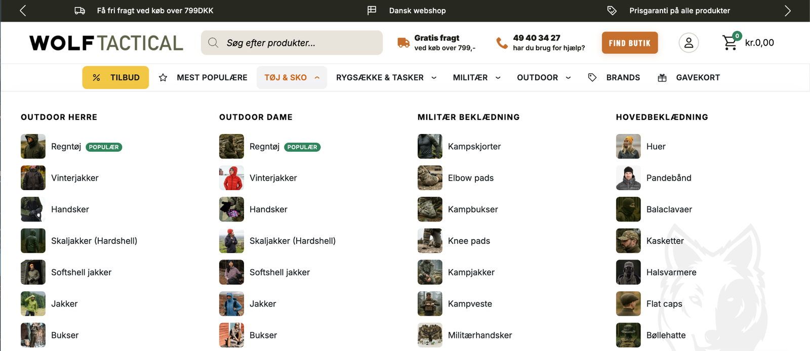
SEOmedSEB Auto Mega Menu builds your navigation from the categories you already have. Point a menu item at a
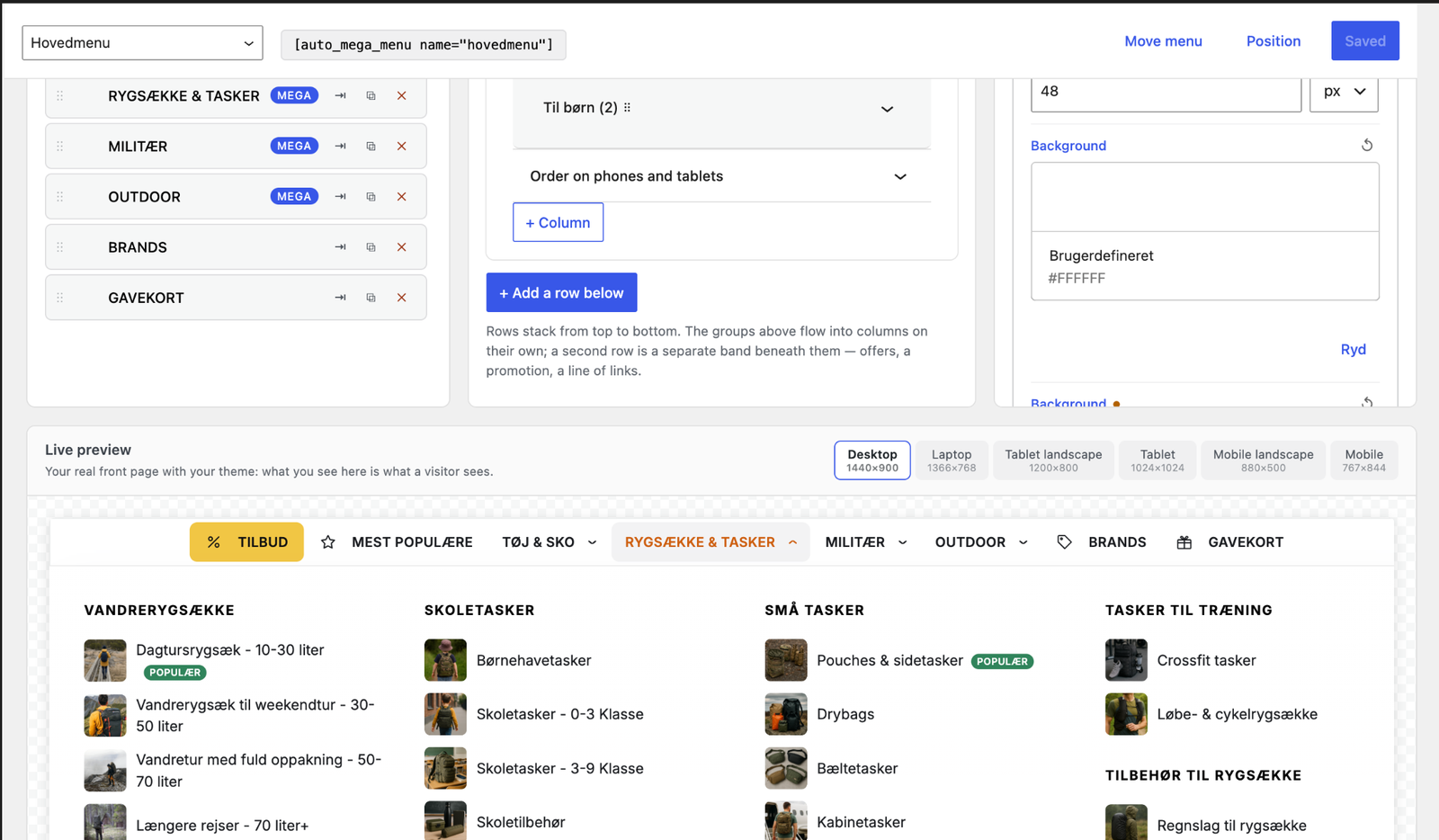
product category and the panel fills itself with that category’s sub-categories, their images and
their links. Add a category in WooCommerce and it appears in the menu on its own. Rename one and the
menu follows.
The panel works out its own shape. Two sub-categories give two columns, not four with gaps. Many
short lists spread wide; a few long ones go taller instead. Columns pack rather than lining up in
rows, so a short category never leaves a hole beneath it.
Built for real shops
- Panels fill from WooCommerce categories and stay current
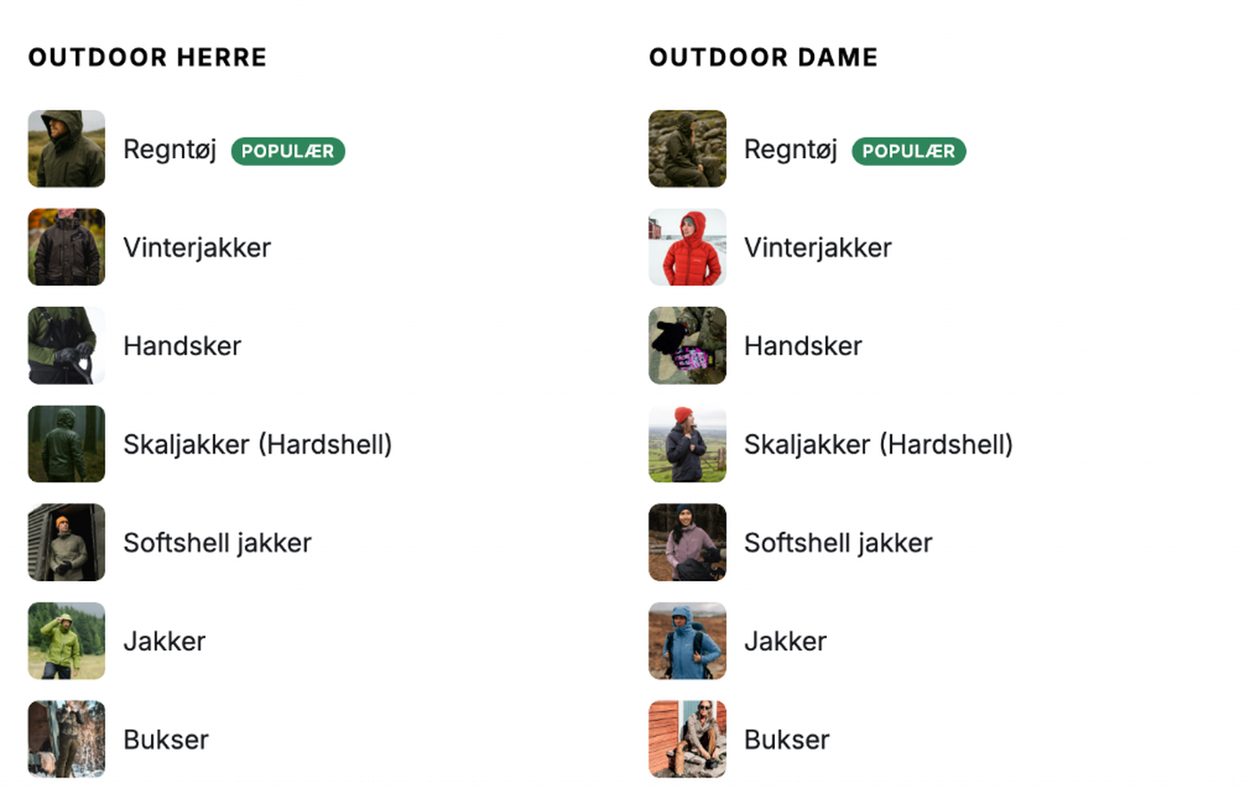
- Category thumbnails are used automatically, with a per-item override or none at all
- Coloured badges (“POPULAR”, “SALE”) on any item, with your own text and colours
- A “See all 18” link when a list is capped, so nothing is silently hidden
- Panels never grow past the screen: they scroll, with a soft edge marking there is more
Designed, not just configured
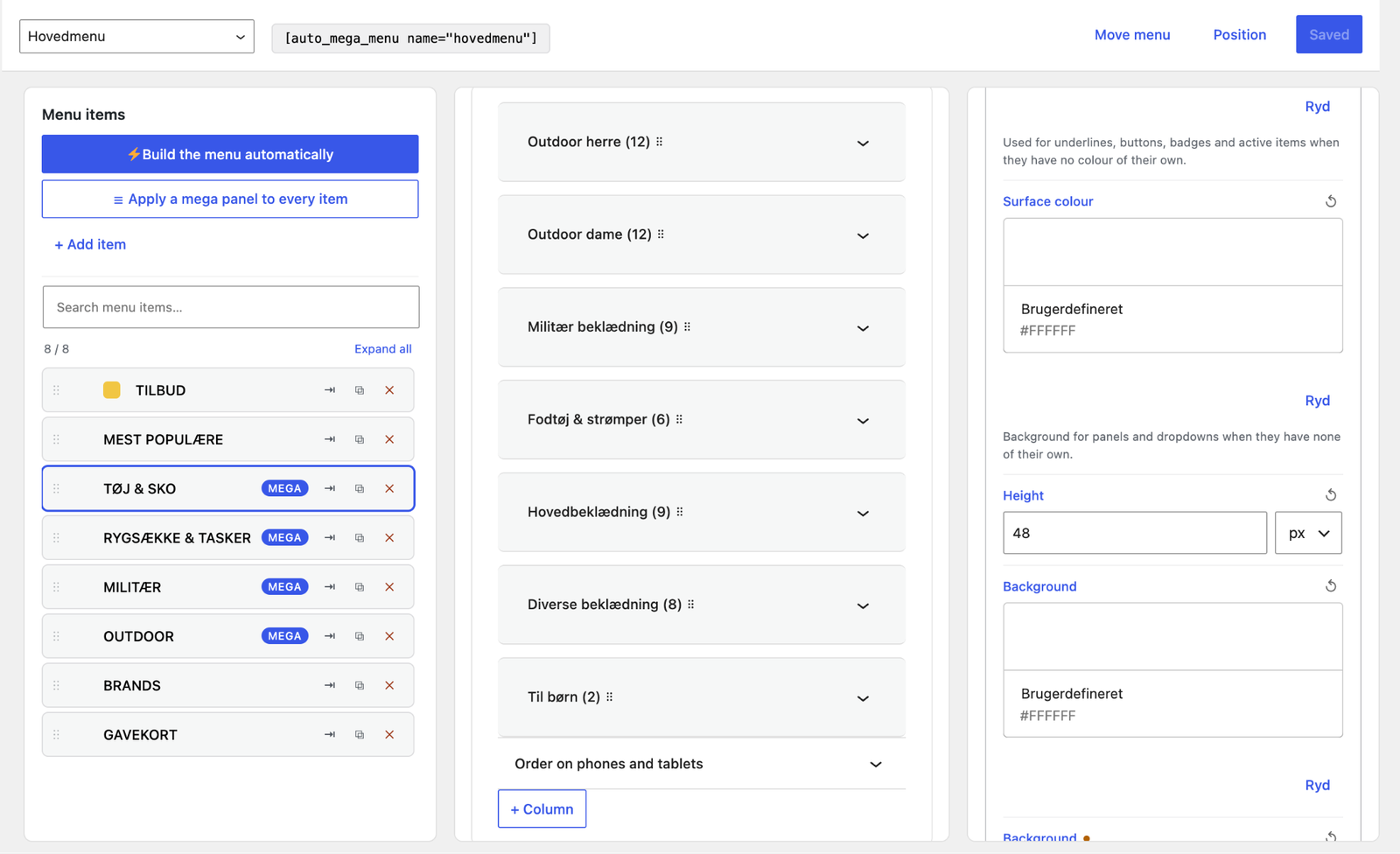
Over 230 style settings across 20 areas, each available globally, per area, per item, and per
breakpoint. Set a typeface and colour once under Global typography and the whole menu follows.
Seven hamburger animations, nine arrow shapes, four panel layouts, seven opening animations, and
four mobile opening effects.
Mobile is its own design, not a squeezed desktop
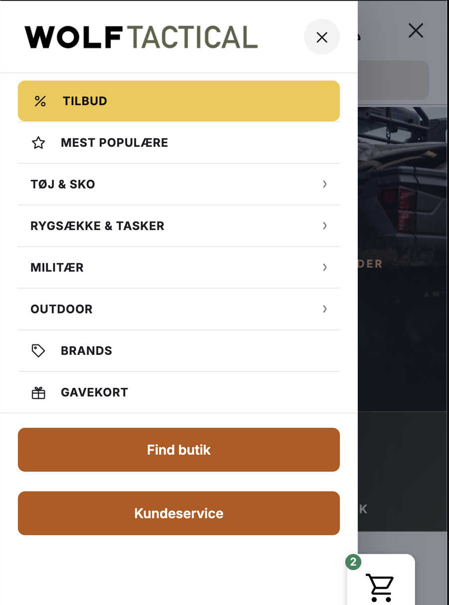
The drawer opens full width with your shop logo. Tapping a category opens the level below rather
than navigating away, so sub-categories are reachable on a phone. The default pattern is hybrid: the
first tap moves to a screen for that department, and everything inside opens in place.
Accessible
Full keyboard navigation, a focus trap in the mobile drawer, correct ARIA state, visible focus rings
for keyboard users only, and 44px touch targets. Touch devices are handled properly: the first tap
opens, the second follows the link.
Works with your builder
Shortcode, Gutenberg block, Elementor widget, a Breakdance element, or by taking over one of your
theme’s menu locations. Menus export and import between sites, matching categories by slug rather
than by database id.
Details
Related plugins
Plugins that also contain the tag mega-menu
Happy Addons for Elementor

Max Mega Menu

Responsive Menu – Create Mobile-Friendly Menu

HT Mega Addons for Elementor – Elementor Widgets & Template Builder

GutenKit – Page Builder Blocks, Patterns, and Templates for Gutenberg Block Editor

WP Menu Icons


About
Plugin for that tries to help you find the WordPress plugin you are looking for.
| Please enjoy an image of Crush (this awesome turtle) and have a lovely day! |  |
We do not own any plugin listed on this site and do not work for or work with WordPress.com or it's associated companies. We simply provide a searchable list of the available WordPress plugins.