

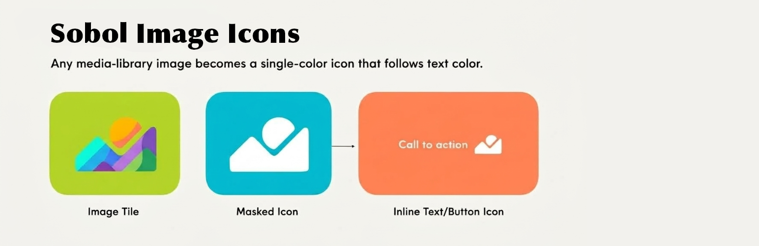

Sobol Image Icons
Sobol Image Icons renders an image as a CSS mask instead of as a picture. The shape comes from the file,
the colour comes from your text. Change the text colour and the icon changes with it.
One arrow file then works on a dark button, a light background and a coloured heading, without
exporting three versions of it.
You do not need an icon set. Most icon plugins hand you somebody else’s library and stop there.
This one uses the images you already have. Drop your own arrow, your own logo mark, a shape a
designer sent you – anything in the media library becomes an icon that matches your palette.
Three places to put one
In a sentence. Pick the icon button in the editor toolbar and drop an icon into running text:
“Read more ”. It scales with the font size, sits where you tell it to against the line, and takes
the colour of the words around it, the way a glyph would. Select it again and its settings open on
the icon itself – swap the image, resize it, set alternative text, or give it a colour of its own
from your theme palette.
On a button. The native WordPress Button block gains an Icon panel. The plugin does not
replace the Button with one of its own, so block styles, colour settings, theme.json styling, the
width controls and link handling all keep working exactly as before. Choose the side, the size and
the gap; the icon takes the button’s proportions from the file, so a tall or wide mark is not
squashed into a square.
On its own. A dedicated block for an icon that stands by itself: size, colour from the theme
palette, left/centre/right placement, an optional link, and the same option to keep the file’s own
colours. Useful when the icon is the point rather than an ornament on something else – centred
above a heading, say.
Animation, when it earns its place
Two independent settings, because they do different jobs.
An idle animation runs on its own to draw the eye – bounce, wiggle, pulse or spin – and you set
how often it plays. The movement is packed into the start of each interval and the icon rests for
the remainder, so “every four seconds” means an occasional flick of attention rather than something
that never stops moving.
A hover animation plays while somebody is on the button and takes over from the idle one:
slide, rotate, spin, grow, bounce or wiggle, at a speed you choose. It runs for keyboard users too,
when the button is focused, so the affordance is not reserved for people using a mouse.
Both are pure CSS, and both stop entirely for anybody whose system asks for reduced motion.
It works for your authors, not only for administrators
This is the part that usually goes wrong elsewhere.
WordPress strips mask-image from inline styles for every user without the unfiltered_html
capability – that is authors and contributors on a single site, and everybody except the super
admin on multisite. A plugin that writes the mask straight into the markup therefore works
perfectly while you build the site and breaks for the people who actually write the posts, often
only noticed on a client’s site weeks later.
Sobol Image Icons carries the mask in a CSS custom property, which survives the filtering, and resolves
it in its own stylesheet. The test suite asserts it on every release, including a test that fails
if anyone moves a mask declaration back into the markup.
Details that matter
- Any image the site accepts. PNG, WebP, AVIF, GIF and more – the editor shows the list your
site actually allows, rather than promising formats it will refuse. Transparency is what defines
the shape, so a file with a transparent background gives the best result. - Keep the original colours when you want the file drawn as it is – a brand mark, say – while
the size, placement and animation carry on working. - Sizes in em, rem, px or vw, defaulting to
emso an icon beside text scales with that text. - No JavaScript on the front end. The icon is a mask, a custom property and
currentColor. - Nothing left behind. The plugin stores a single option and removes it when you delete it.
Accessibility
An icon with alternative text is announced to screen readers. Leave it empty and the icon is
marked decorative and skipped, which is what you want when it sits beside text that already says
the same thing. Animations respect prefers-reduced-motion, and hover effects are reachable from
the keyboard.
Source code
Everything in this plugin is human-readable except build/icon/index.js, which is compiled and
minified from TypeScript.
The source it was built from is at https://github.com/lsobolew/sobol-image-icons, tagged v0.1.0 for
this release. The block sources are in plugins/sobol-image-icons/blocks/, and the build is reproduced
with:
npm ci && npm run build in `plugins/sobol-image-icons/`
That writes build/ from blocks/ using the configuration in the same directory – no other step,
and nothing fetched at build time beyond the locked dependencies.
Details


Related plugins
Plugins that also contain the tag block
Spectra Gutenberg Blocks – Website Builder for the Block Editor

Breadcrumb NavXT

WP Go Maps (formerly WP Google Maps)

Otter Blocks – Gutenberg Blocks, Page Builder for Gutenberg Editor & FSE

PDF Embedder

Layout Grid Block

About
Plugin for that tries to help you find the WordPress plugin you are looking for.
| Please enjoy an image of Crush (this awesome turtle) and have a lovely day! |  |
We do not own any plugin listed on this site and do not work for or work with WordPress.com or it's associated companies. We simply provide a searchable list of the available WordPress plugins.