Description
If you need two, three or more columns of text or images and need them to be exactly the same using on CSS3 then this is it.
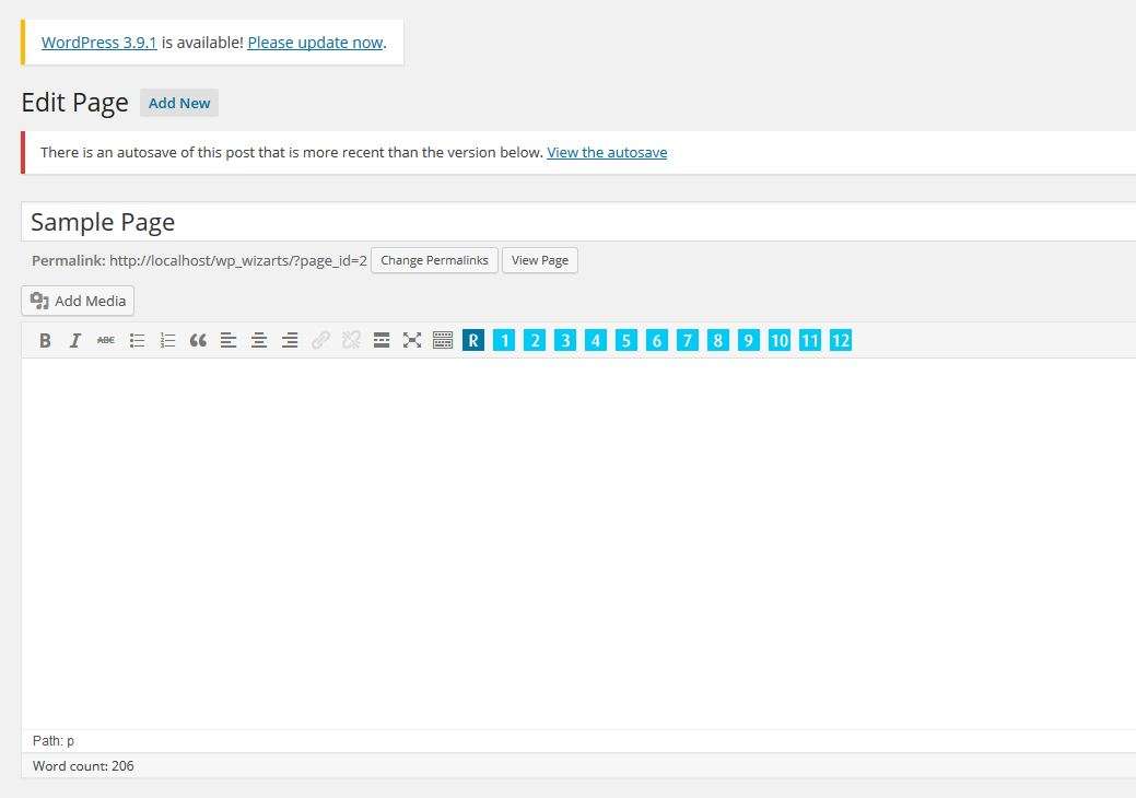
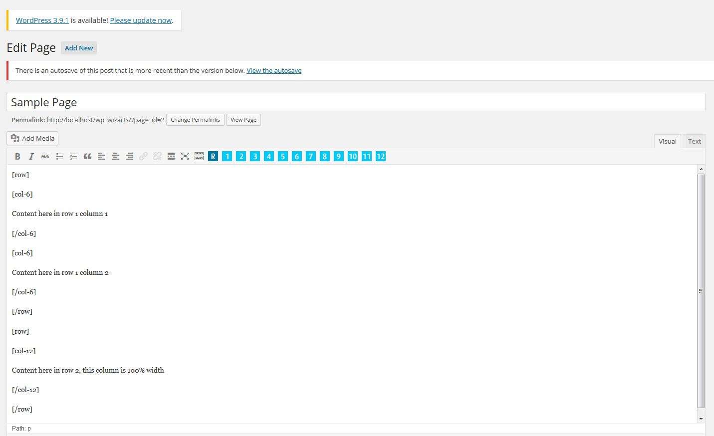
First insert a [row] shortcode (this needs to wrap around every new row) then click the numbers until you have added shortcodes that add up to 12.
Example –
[row]
[p-col-3]
Content Here
[/p-col-3]
[p-col-3]
Content Here
[/p-col-3]
[p-col-3]
Content Here
[/p-col-3]
[p-col-3]
Content Here
[/p-col-3]
[/row]
These rows will collapse for mobile devices.
Feel free to over write the css in your themes style sheet.
NOTE
This uses box-sizing:border-box in the css you may notice a slight change in your theme if not already using this.
If you do you will need to adjust your themes css.
Basically you may find you lose width in your DIVs, it should be just an easy matter of adding some width to these DIVs.
What box-sizing:border-box does is set your width, for example:
If your DIV was set to a width of 100px and you added padding-left:5px; border-left:1px solid; this padding and border will be added inside the DIV in turn not effecting the 100px width. With out this in the css 100px width would be expanded to a total of 106px.


