Description
Thank you for your interest in our plugin. Qodeblock is developed by our experts to improve WordPress web design and user experience of your website. This plugin allows to extense your WordPress editor with easy-to-use blocks with powerful functionality.
Qodeblock is a collection of page building blocks for the new [Gutenberg] block editor. Blocks are chunks of content such as paragraphs, images, galleries, columns, and more. Building with blocks gives you more control to quickly create and launch any kind of site you want!
Adding the customizable Qodeblock plugin adds a collection of beautiful, site-building blocks to help you customize page layouts, increase engagement, and get results for your business.
Along with the content blocks you’ll find in Qodeblock, we’re also publishing helpful articles and tutorials to help you get started with Gutenberg.
Qodeblock BLOCKS
Advanced Columns Block – View Block
The Advanced Columns Block empowers you to make your very own page format with a basic arrangement. You can specify number of sections, and format every section to your liking. You can also customize the colors, margins, paddings, responsiveness, and much more.
Accordion Block – View Block
Accordion block provide accordion effect to your blocks, allowing you to display information in collapsible rows. This block is usually used to display collapsible content such as FAQs or to manage the display of different text heavy content.
Author Profile Block – View Block
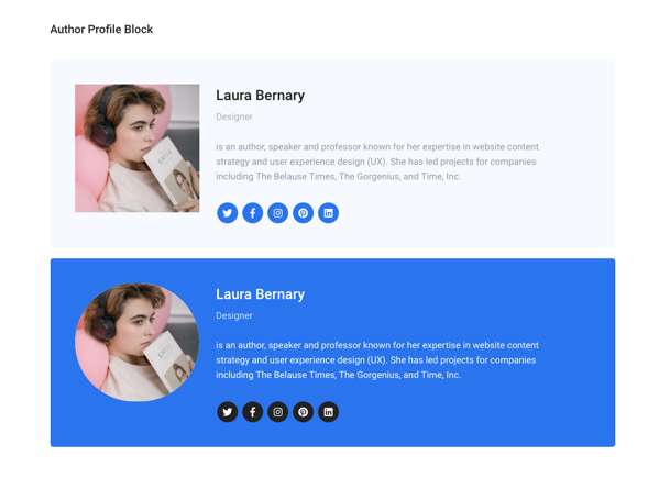
The Author Profile block enable you to display a user’s name, bio and profile image. You can enter a name, add a position and a description, download an avatar, and provide links to social networks. Alternatively, you can change the font size, avatar shape, background color, text color, link color, and social media URLs in the block.
Button Block – View Block
The Button Block allows you to add buttons linking to other pages on your website or to an external page. You can set the style of the button and adjust it according to the design of your website. The following options are available for setting: the link target, button shape, button size and button colors.
Call to Action Block – View Block
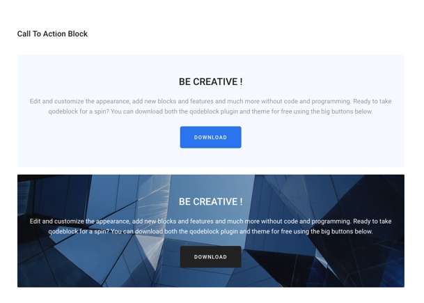
The Call-To-Action block is great tool for bringing attention to actionable items or buttons that you want your users to click! You can prompt them to learn more, download, buy and that’s only the tip of the iceberg.
Container – View Block
The container is flexible block that allows you to gather several individual blocks into a parent container. You can set the desired color or image to the background. You can also customize the Drop Cap Litter and set the font size.
Drop Cap Block – View Block
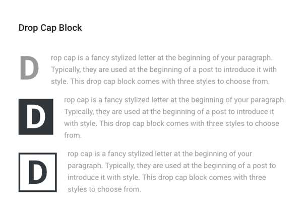
Drop caps are a specific kind of initial letter, large letters that appear at the beginning of a block of text. A drop cap is used as a decorative element at the beginning of a paragraph or section.
Email Newsletter Block – View Block
The Newsletter Block provides you with a quick and easy way to add email subscription forms to your website. Adding subscription forms to your website has never been so easy!
Inline Notice Block – View Block
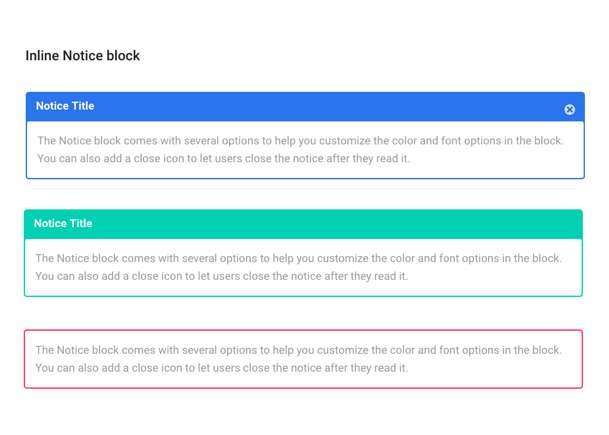
You can user this block to create notifications or special messages on the page. It helps to highlight some information or draw interest to specific content. The block also comes with settings for font size, notice color, text color and whether or not to make the block dismissible.
The dismissible notice works by using localStorage. Once you close the notice on the front end of the site, it won’t show again unless you clear out your localStorage. Please note that if you close the notice on the front end, you will still see the block in your editor until you remove it.
Pricing – View Block
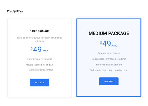
The Pricing Box block allows you to display pricing options, service packages, inclusions, and more. All blocks are configurable. You can add an image, price, control the background colors, text colors, layouts, and the position of any of the pricing tables.
Post and Page Grid – View Block
This block gives you quick access to create beautiful post grid and post list. You can add them to any post or page on your site and configure easily, without any line of code! You can customize block and change it as you need.
Sharing Icons – View Block
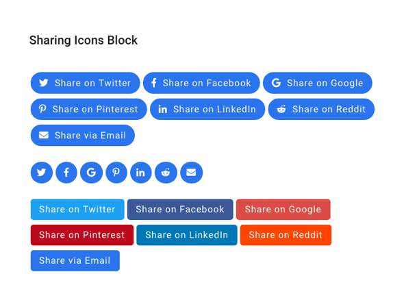
This block makes it super easy to add social media sharing icons anywhere on your post or page. Here’s the list of available Social Media: Twitter, Facebook, Google, Pinterest, Linkedin, Reddit, Email. You can also change shape, size, color of the icon and select what you want to display (only icon, only text or icon with text).
Spacer block – View Block
The block allows you to creatively divide the content of a page or post using spacing or line. You can experiment with the design, changing the height, color and style of the divider in the block settings.
Testimonial Block – View Block
This block allows you to display a customer testimonials in your content. Customize the font size, avatar shape, background color, text color, link color and social media URLs.
Qodeblock currently includes the following blocks:
- Advanced Columns Block – View Block
- Accordion Block – View Block
- Author Profile Block – View Block
- Button Block – View Block
- Call to Action Block – View Block
- Container – View Block
- Drop Cap Block – View Block
- Email Newsletter Block – View Block
- Inline Notice Block – View Block
- Pricing – View Block
- Post and Page Grid – View Block
- Sharing Icons – View Block
- Spacer block – View Block
- Testimonial Block – View Block
Top Web Design Companies: Everything You Need to Know who use our plugin.
Check out the top 5 firms below or scroll down for the entire list and more info!

