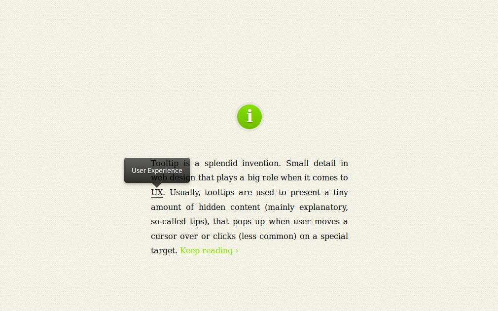
Description
tooltips are used to present a tiny amount of hidden content (mainly explanatory, so-called tips), that pops up when user moves a cursor over or clicks (less common) on a special target.
Key Features
- It’s responsive. It relies on a maximum width value when viewed on large screens, adopts to narrow environments and picks the best viewable position relatively to the target (top, bottom; left, center, right).
- It’s mobile-friendly. It pops up when a call-to-action button is tapped and disappears when tapped on the tooltip itself.
- It’s HTML formatting capable. Need to write some words in italic or so? No problem, this will work out.
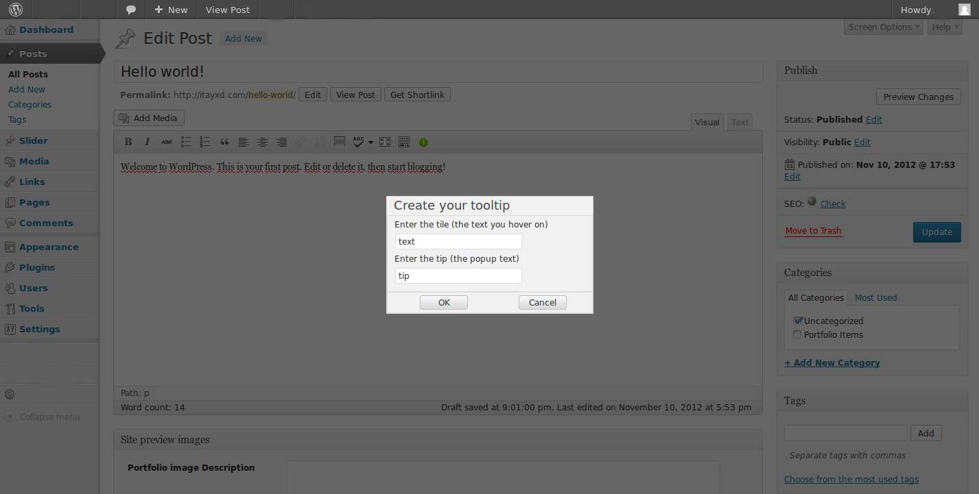
- It’s extremely easy to use: A tooltip button in added to the default WordPress editor, all you have to do it click it and fill the pop-up dialog, the rest is taken care of automatically.
Advance
- The button adds a WordPress short-code, if you want the tip to be HTML formated (avoid block level elements) you can just wrap it with [tooltip tip=””][/tooltip] in tinyMCE.
- You can also assign the attribute rel=”tooltip” and title=”Enter your tip here” to any of body tags in HTML file where you want the tooltip to pop up when called.
- You can change the pop-up look by editing responsive-tooltip.css. change it to what ever suits your website best!


